
Your Mind is a Powerful Asset, But Can Also be a Liability
August 21, 2019
Word-of-Mouth Advertising Creates the Easiest Customers, but is Not So Easy to Get
September 11, 2019
Choosing a design and color palette for a logo is a very personal thing. The actual design of a logo, especially for small businesses is more important to the business owner than the rest of the world.
If you are a giant corporation, a logo can be very important. For instance, people will buy Nike just because they want to be seen with the Nike swoosh.
For small businesses, it is rare that logo design will impact the sale, or have clients buying from you just because they want to be recognized with your brand.
However, choosing the right logo colors may have a subliminal effect on how you are perceived in the marketplace. The right color choices can highlight your business’ strengths and help you attract the right customers. And, as you might guess, the wrong combination can have the reverse effect.
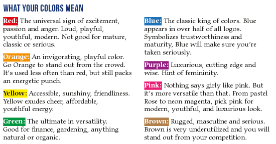
There is a concept called color psychology, which tells us that colors impact our emotions and behaviors. Yellow is cheerful, and green is calming.
But do these “rules” really translate into logo color meanings? Often, yes, but there are no absolute rules. However, when designing a logo, it makes sense to try to use colors that generally fit the profile of the type of client you are targeting. Below is a list with some general guidelines.


